
Travel experience platforms · Case study 02
GetYourGuide makes the destination—not the product category—the primary search object. It then turns a city or landmark into a structured marketplace of comparable activities.
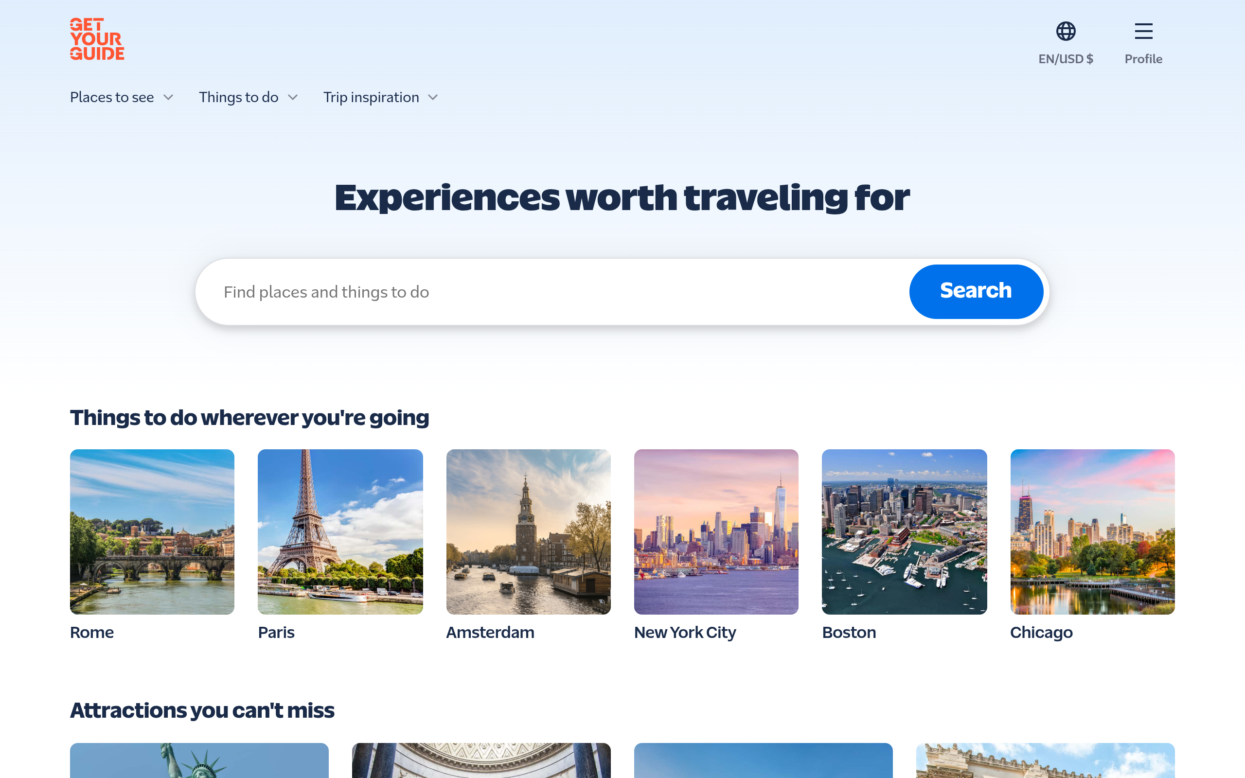
What is GetYourGuide—and what is this site designed to do?
GetYourGuide is an online marketplace for tours, attractions and travel activities. Its public homepage frames the service around the traveller’s destination rather than around an internal product catalogue: find a city or activity → identify a landmark → compare tour variants → reserve with terms that feel safe.
Destination-led travel activity marketplace.
Turn “I am going to Rome” into one specific, credible activity booking.
Own the destination and landmark question before the user reaches a product-level comparison.
What we checked
01. Entry architecture: city and landmark pages act as search landing pages
The architecture meets the traveller where search begins: a place, an attraction or a trip idea. That creates durable landing-page roles for broad destination intent instead of forcing every user into a generic “tours” category.
What to test next: crawl the destination → landmark → product path to confirm each layer has a distinct canonical purpose rather than near-duplicate inventory pages.
02. The Rome page: comparison happens before the product page
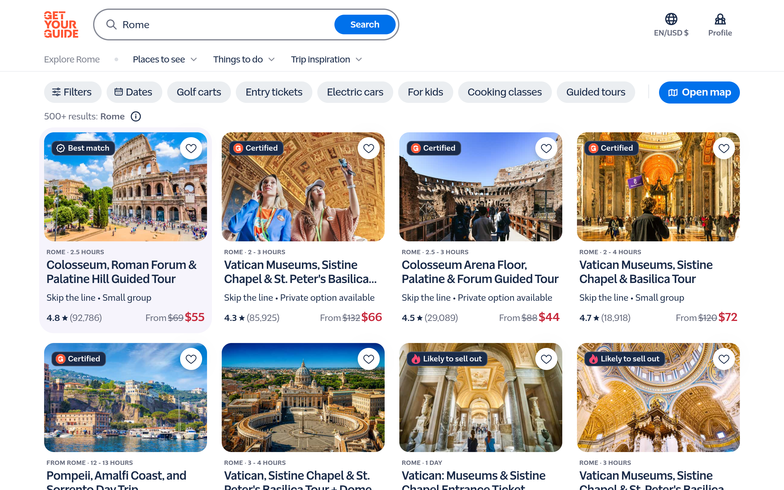
The card is an unusually dense decision unit: duration, skip-the-line, group type, Certified or likely-to-sell-out labels, rating, review count and current/previous price are visible together. This turns one landmark into comparable options instead of an opaque product list.
These signals make a strong promise. A deeper product-level audit must test whether pricing, availability, cancellation and “Certified” criteria remain traceable and consistent once a visitor opens a specific listing.
03. Trust is distributed through the path, not saved for checkout
GetYourGuide’s visible marketplace design embeds trust into discovery: review volume sits beside the rating; “Certified” and scarcity badges appear before the click; duration and group format reduce suitability uncertainty. The Korean homepage also translates this logic rather than hiding it: Korean cards expose duration, pickup, small group, audio guide, rating and KRW pricing.
GEO READING
A page that helps a person compare is easier to cite responsibly.
The important part is not adding badges. It is exposing the attributes behind a recommendation—where, how long, what format, how many reviewers and at what starting price—close to the entity being recommended.
04. Support is structured by the moment the trip goes wrong
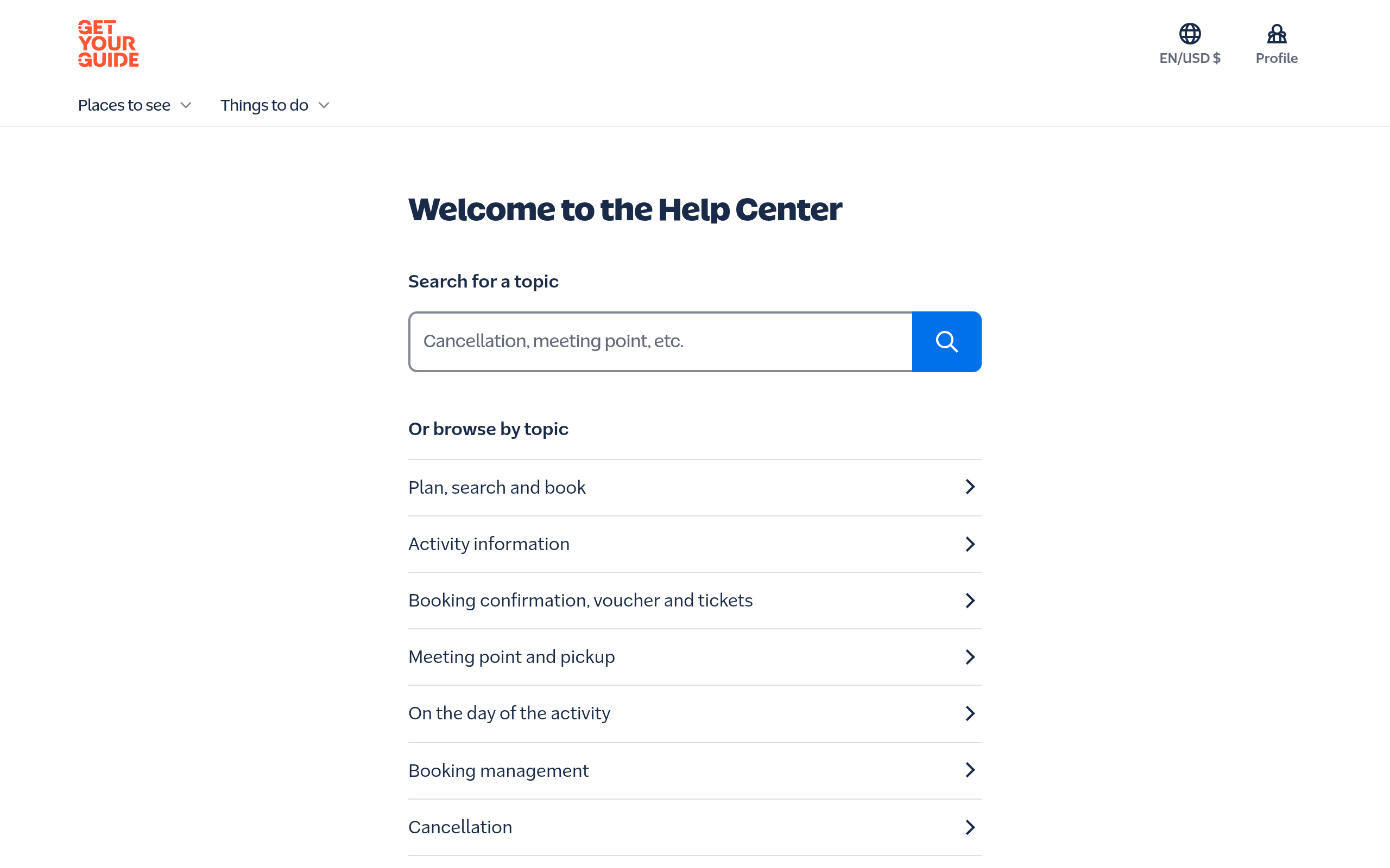
This is a problem architecture, not an internal department menu. The traveller can enter with a concrete failure mode—voucher, pickup, cancellation or booking change—and sees an explicit support route.
What to test next: audit individual answers for policy ownership, update dates, direct answers and links back to the affected product. A help centre becomes GEO-ready only when the route ends in a verifiable answer.
Final diagnostic
Audit evidence and limits
Inspected: October 16, 2026, logged-out public pages: homepage, Rome and Help Center. Korean-language homepage behaviour was also visually inspected.
Not measured: rankings, citations, analytics, conversion, full-template crawl, signed-in flows, or internal supplier criteria. This is a public-signal consulting audit, not a performance claim.
Leave a Reply